What Are We Designing For Anyway?
Sometimes the best question isn’t what we’re designing for, it’s who. And when it comes to accessible learning, that question becomes even more essential.
To be honest, that’s not always the easiest question to answer. As learning designers, it may feel that we aren’t always in the best position to go and talk directly to the people who interact with the learning experiences that we create.
When there isn’t much time for pause, we tend to lean on the info we know, reach for what’s readily available, and apply the best practices that we’re used to. Like putting on the same shoes each day, and getting to work with a cup of coffee, we trust that the basic things we rely on are going to continue to work for us.
Ultimately, we’re trusting that people somewhere out there who we never see or talk to, already looked after the inner workings of these basic things we enjoy, and how to bring them to our fingertips. In a sense, the great work of others makes the availability of everyday things that we enjoy and access possible.
Here’s an exercise to think on for a minute – how would you get along in your day if a few of the basic things that you’re used to weren’t there? It may not be easy going day in and day out… and you may not be able to do everything you need to do all on your own. Maybe you can recall a time in your past where that was the reality.
With that in mind, let’s talk about digital accessibility and taking a moment to walk a mile in someone else’s shoes. Accessible learning isn’t just about compliance – it’s about addressing real needs in people’s daily experiences so they can succeed and prosper too, despite impairments or disabilities they face the world with.
Watch our full webinar on 10 Easy Wins for Accessible Learning >>
What Kinds of Digital Accessibility Needs Exist?
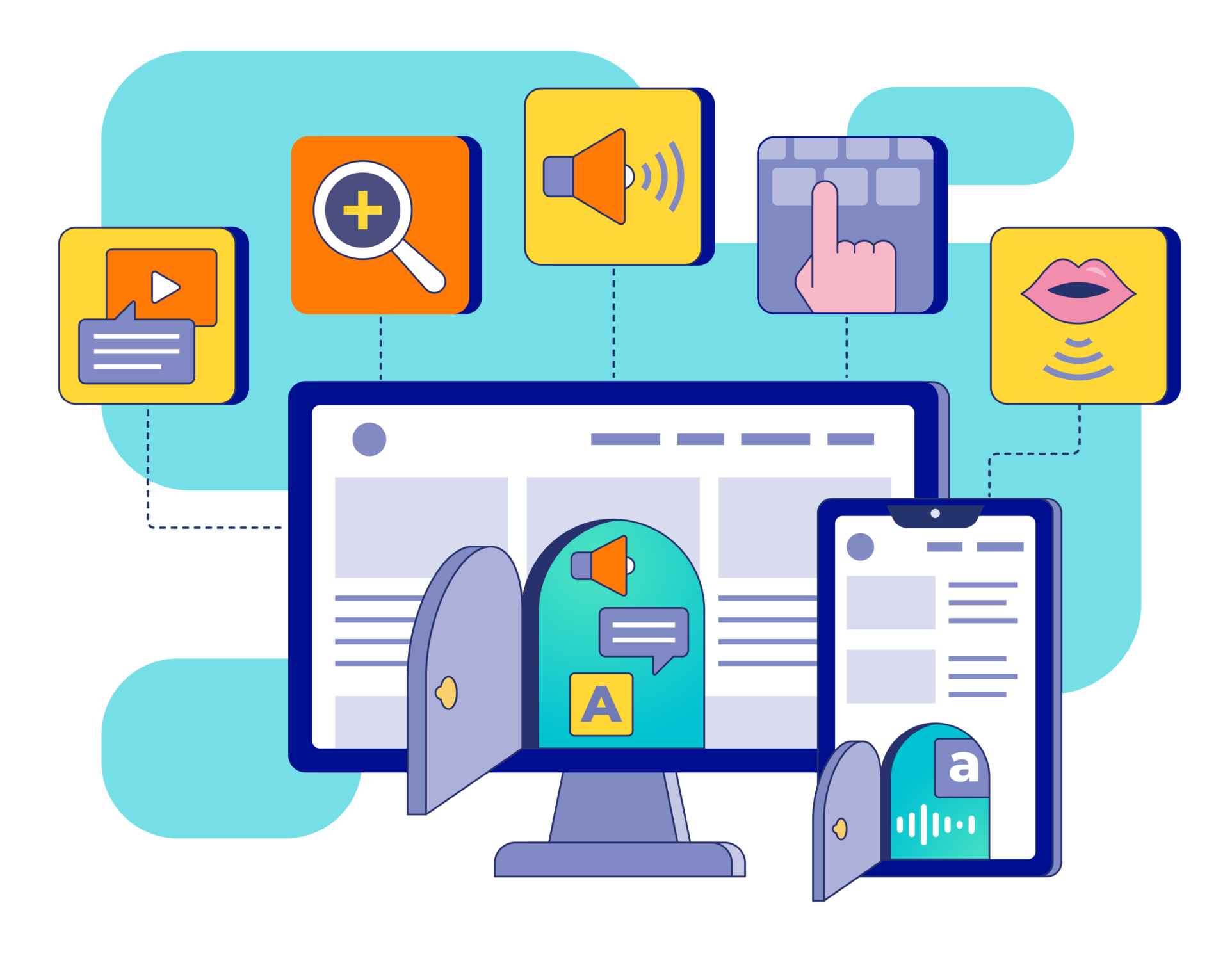
People interact with digital content in all kinds of ways. Digital accessibility can relate to vision, hearing, motor coordination, speech, cognitive, and neurological challenges. About 15% of the global population has some form of disability, up to 1 in 6 people (WHO).
Individuals with visual impairments, such as blindness or color blindness, may rely on screen readers, magnification tools, and high-contrast settings to access digital content. Deaf and hard-of-hearing individuals may need captions, transcripts, and visual cues to access video and audio-based content.
Individuals with mobility, motor coordination, or speech impairments may also rely on alternatives. For example instead of using a typical computer mouse or mousepad, individuals may navigate exclusively with a voice input, keyboard, text-based or other specialized interactions to access content.
Individuals with cognitive or neurological challenges may struggle with complex layouts, overwhelming visuals, or excessive on-screen motion – a clean design with simple navigation and readable fonts helps create a user friendly experience and easier access too.
When designing for cognitive accessibility, it’s helpful to apply frameworks like the AGES model, which guide us to create learning experiences that are easier to focus on, emotionally resonant, and spaced for better retention—all key factors for accessible learning.
Real Stories That Highlight Accessibility in Online Learning
Understanding the real challenges people face is essential to building accessible learning. One of the most powerful ways to design with empathy is to listen directly to those with lived experience navigating digital accessibility every day. Their insights offer invaluable perspectives—and reminders of why inclusive instructional design matters so much.
“Even though I could see myself on a monitor right here using my peripheral I can’t read any of that stuff on the monitor. Even though it’s a giant 32-inch monitor and it’s close enough that I can touch it.”
(Video: Stargardt Disease / Macular Degeneration – How I See: The Blind Life)
“If there’s no captioning, you know, on the video, then we’re not going to be learning anything from what you’re saying on the video. So it’s very important that you have captioning.”
(Video: To Care & Comply: Accessibility of Online Course Content)
“Eye gaze technology allows me to control the software interfaces and it means that this is one of the few things I can do totally independently…”
(Video: Coding Accessibility: Becky)
“’I’m excited for everyone to get to try [Apple Vision Pro], it is truly going to change lives, it’s going to allow people with disabilities who have limited mobility to work and be transported to places that they may never get a chance to go…”
(Video: Apple Vision Pro Accessibility Features: Navigating Without Hands)
“This is Marc Sutton, from the University of California San Francisco’s IT Web Services Department, here today with a brief tour of screen reading technology. I’m a blind person who has been using screen readers, Braille writers, scanning equipment, other adaptive technologies since my childhood.”
(Video: Screen Reader Demo for Digital Accessibility)
Tip: Search YouTube for terms like digital accessibility, adaptive technology, or assistive technology. You’ll find all kinds of insightful videos that people have shared.
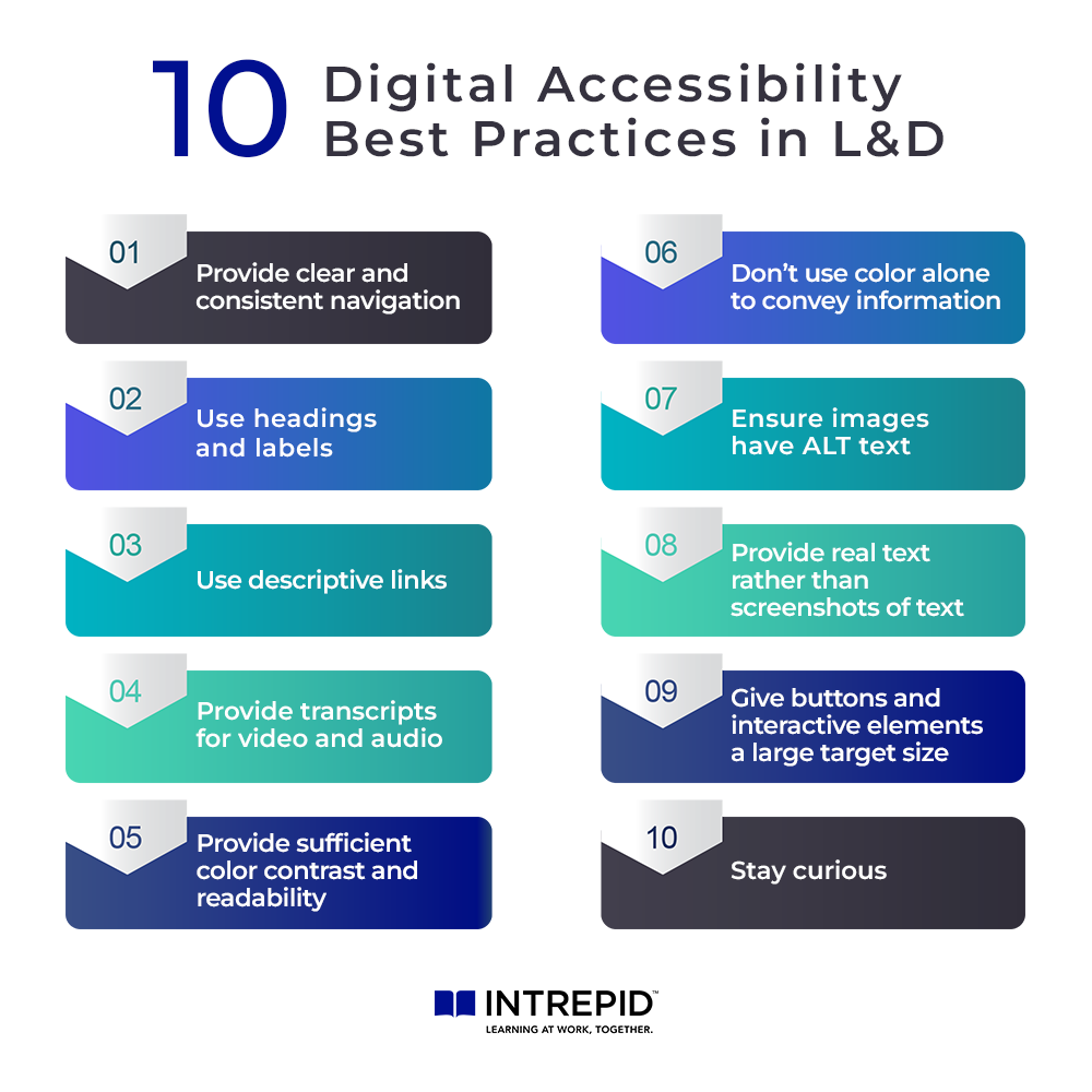
10 Accessible Learning Wins That You Can Impact Now
When it comes to accessible elearning, even the small wins all make a difference. Choices like using clear text formatting with headers, maintaining good color contrast, descriptive labels on links, adding alt text to images, providing large clickable areas, captions and transcripts, all contribute to improved accessibility. Here are 10 digital accessibility best practices.
1. Provide clear and consistent navigation
Navigation should be easy to understand and use. Present learners with a consistent navigation structure and clear labeling to help them find their way around.
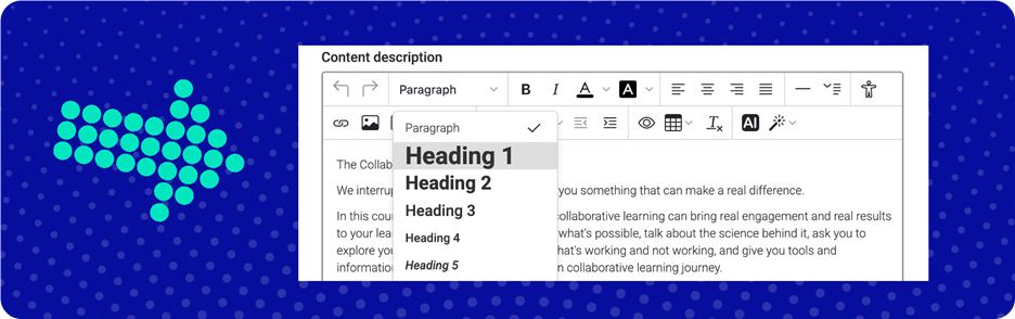
2. Use headings and labels
Use headings to format appropriate sections of text. When available in text editors, use heading styles (h1, h2, h3, etc.). Headings provide clear content structure and help those navigating with screen readers to quickly get to the content they need. Imagine that your learning content is being read to you and the headings (and titles) are your primary way finding the info you need. This is the experience of many people who use screen readers.
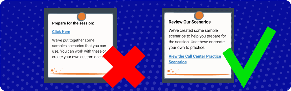
3. Use descriptive links
Instead of “Click here,” use meaningful link text that says something about the content of the link. Users can then understand what that link leads them to. Think about it this way, if you use Google Maps to navigate in your car, how awful would that experience be if the only thing it could ever tell you was “Go here”? Use descriptive links because it does make a big difference!
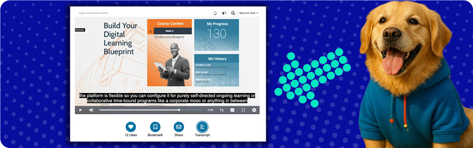
4. Provide transcripts for video and audio
Users may not be able easily to access video and audio content. Providing transcripts for videos and podcasts ensures that more users can access the information. Whether they’re accessing with assistive technologies, have permanent or temporary impairments to hearing or vision, maybe aren’t learning in their native language, or they just forgot their headphones, captions and transcripts are a friend to all users.
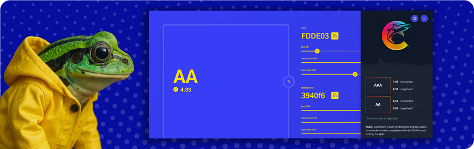
5. Provide sufficient color contrast and readability
Contrast between text and background should make that text easy to read, and background images, gradients, or visual elements should not interfere with text readability. Make sure your text color choice has a contrast ratio of at least 4.5:1 against its background for standard 14pt to 18pt text, and at least 3:1 contrast for 18pt text and larger. Text should be clear as day. Try to avoid camouflaging!
6. Don’t use color alone to convey information
Not everyone sees color in the same way. Pair color with clear, descriptive information—like text labels that describe the information, its purpose, or status. You can also enhance information with multiple cues: icons can be a visual representation that complements the text and underlines emphasize hyperlinks. This ensures your message is understood and accessible, regardless of how someone perceives color.
Think of it like the illustrated mouse at the signpost: if the signs only showed colors—blue, yellow, and green—the mouse would have no idea where to go. But with meaningful labels like “Library,” “Cheese Room,” and “Exit,” plus helpful icons, the path is simple and clear.

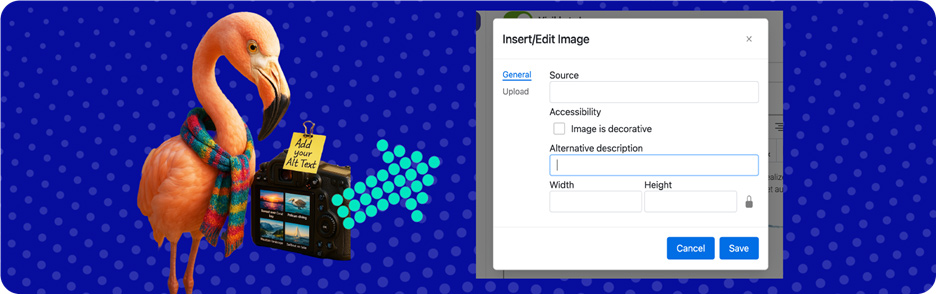
7. Ensure images have alt text
Alt text is a written description of an image that screen readers use to convey content and purpose of an image. Where possible ensure relevant, informational images include meaningful alt text to concisely describe their content and purpose.
If images are only for visual style and have no connection to content, as in they don’t add meaningful information to the content of a page, it is ok to leave alt text blank. Screen readers can skip over it and it won’t clutter the important content with excess information.
8. Provide real text, rather than screenshots of text
Avoid screenshots of text and text heavy images – screen readers cannot access that information. Instead, if an image contains important information, provide that as real text within the content or in alternative accessible format. Otherwise your learning content experience might be like book with partial pages, whole pages, or whole chapters missing – that’s no good!
9. Give buttons and interactive elements a large target size
Make sure buttons and interactive elements are big enough to click or tap easily. Tiny buttons can be frustrating—especially for people with limited mobility, hand tremors, or those using alternative methods of content interaction. Give buttons plenty of space and make sure they’re easy to tap without precision.

10. Stay curious
If you can, make time to learn about your learners, hear from them, and ask for feedback. If you can’t hear from learners directly, try talking to the people who can tell you more about them as a secondary source. A few minutes to grow your understanding goes a long way towards knowing how to create impactful and inclusive instructional design that keeps learners engaged. That way, we can ensure that the learning we create makes a difference by remembering that people are at the heart of it.

Tools That Can Help You Improve Digital Accessibility
- ColorShark.io – Check and Improve Color Contrast for Accessibility
- Otter.ai – Real-Time AI Captioning and Transcription Tool
- WAVE – Web Accessibility Evaluation Tool
Interested in Learning More?
- Accessguide.io – Illustrated Best Practices for Accessible Design in Products and Websites
- W3C – Web Accessibility Perspectives: A Compilation of 10 Topics (Video)
- Tetra Logical – Web Content Accessibility Guidelines Primer
- Section508.gov – Create Accessible Captions and Transcripts
- Harvard Digital Accessibility – Alt Text Best Practices
Conclusion: Accessibility in Online Learning Starts with Intention
Accessibility in elearning doesn’t require perfection—it requires awareness, empathy, and small intentional choices. Each of the 10 simple wins we’ve shared is an opportunity to improve the learner experience for someone who might otherwise be left out.
When we keep inclusive instructional design in mind, we’re not just checking a box—we’re designing accessible learning for real people, with real needs, in real environments. And more often than not, what makes a course more accessible for some makes it better for everyone.
Want to see these ideas in action? Check out this webinar, “10 Quick Wins in Digital Accessibility, Designing for Everyone,” where we share practical tips, examples, and tools on how to make elearning accessible.
You might also be interested in “The Do’s and Don’ts of Visual Design for Virtual Learning.”
Frequently Asked Questions About Accessible Learning
How do you accommodate learning disabilities in the workplace?
By designing learning experiences that meet a range of needs—such as offering transcripts, alt text, keyboard navigation, clear layouts, and descriptive links—you empower employees with visual, hearing, motor, or cognitive challenges to fully engage and succeed.
What are 10 digital accessibility best practices?
Ten digital accessibility best practices include:
- Provide clear and consistent navigation
- Use headings and labels
- Use descriptive links
- Provide transcripts for video and audio
- Provide sufficient color contrast and readability
- Don’t use color alone to convey information
- Ensure images have alt text
- Provide real text, rather than screenshots of text
- Give buttons and interactive elements a large target size
- Stay curious
What is the meaning of accessible elearning?
Accessible eLearning means designing digital training that everyone can use—regardless of ability. It ensures that people with disabilities can interact with content through screen readers, captions, keyboard-only navigation, and more.
What is elearning in the workplace?
Workplace eLearning is digital training used by organizations to upskill employees, onboard new hires, or support professional development. It’s often self-paced and accessed online—but the best programs are designed with accessibility and inclusion in mind.
How can I make learning more accessible?
Start small: use clear headings, readable fonts, alt text for images, transcripts for video/audio, good color contrast, and large clickable areas. These 10 simple wins from our blog are great first steps that benefit all learners.
How to ensure accessibility in elearning?
Follow digital accessibility best practices (like WCAG), test your content with tools like WAVE or ColorShark, and keep learners’ real-world needs in mind. Don’t just comply—design with intention and empathy.
What are the accessibility standards for LMS?
Most LMS platforms aim to meet WCAG 2.1 AA standards and Section 508 compliance—but the accessibility of the learning content you upload is just as important. Design matters as much as the platform itself.
What is accessibility in online learning?
It’s about making sure all learners—regardless of disability—can navigate, understand, and interact with your learning materials. True accessibility isn’t just about compliance; it’s about creating inclusive learning experiences that work for everyone.